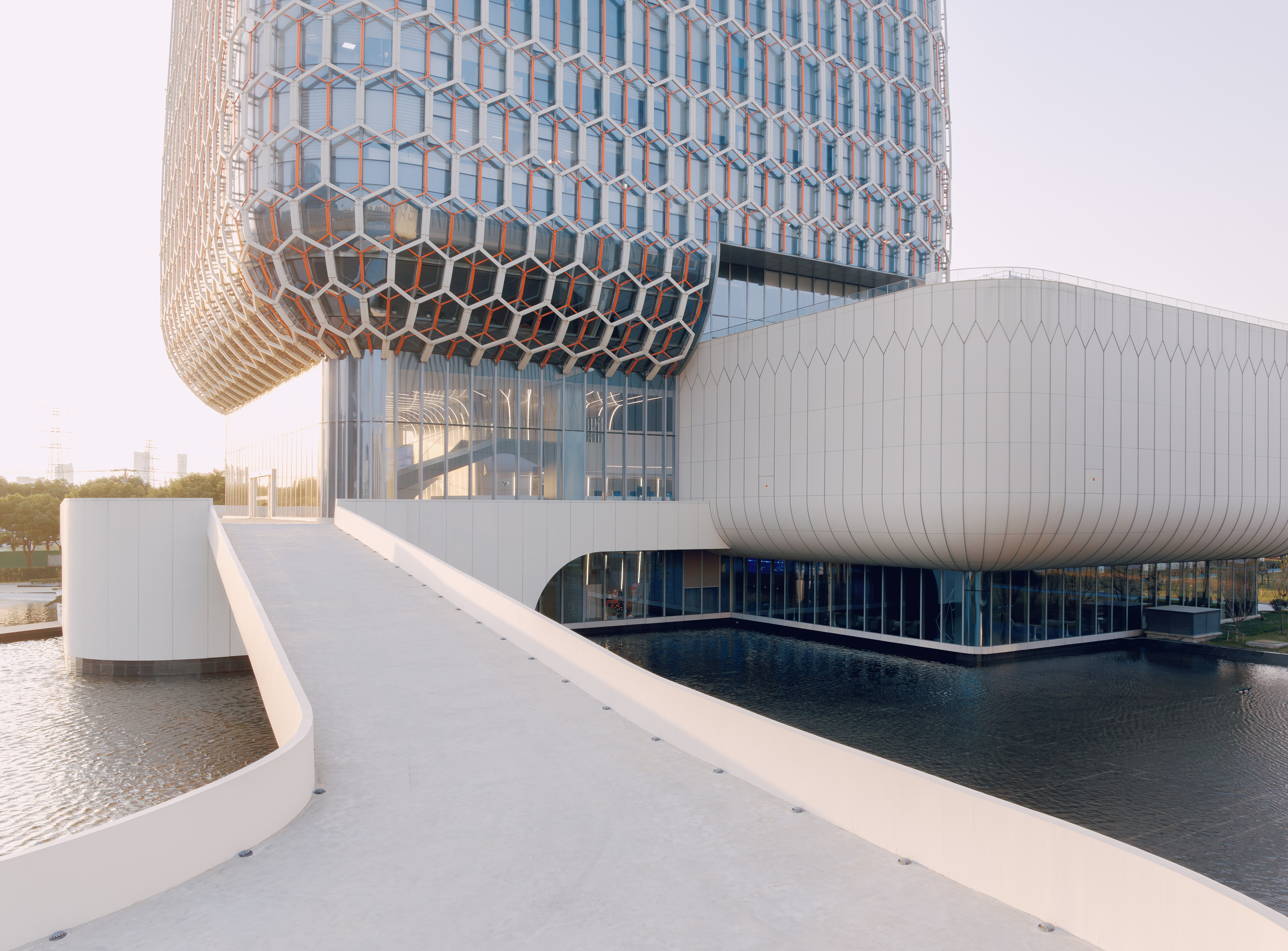
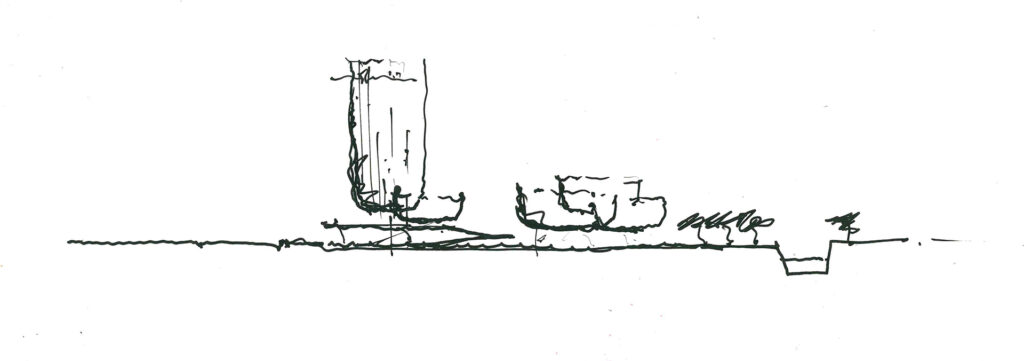
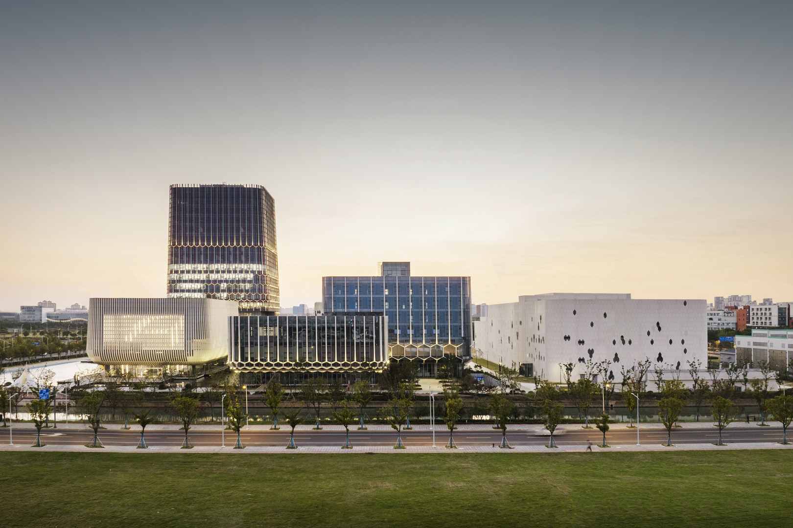
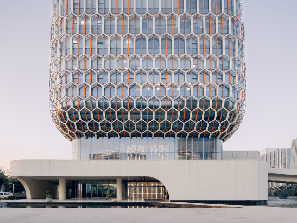
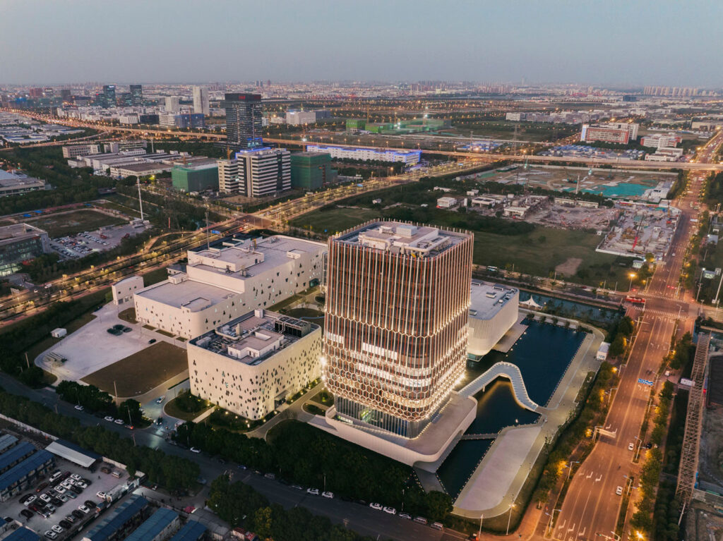
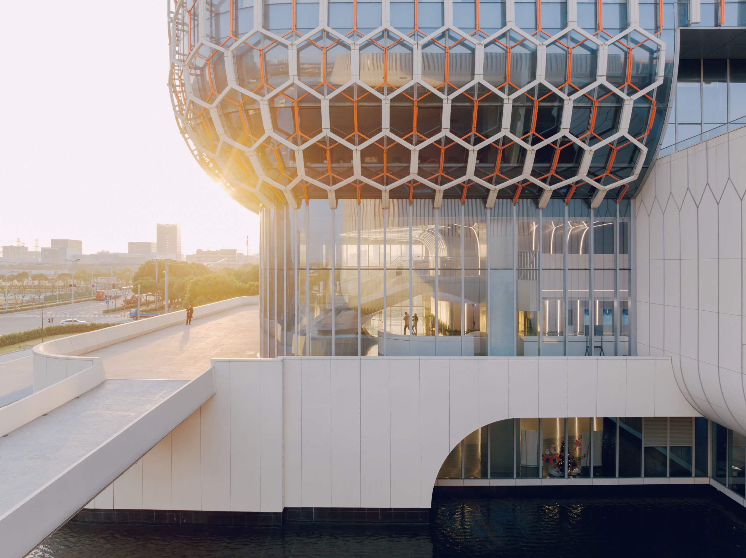
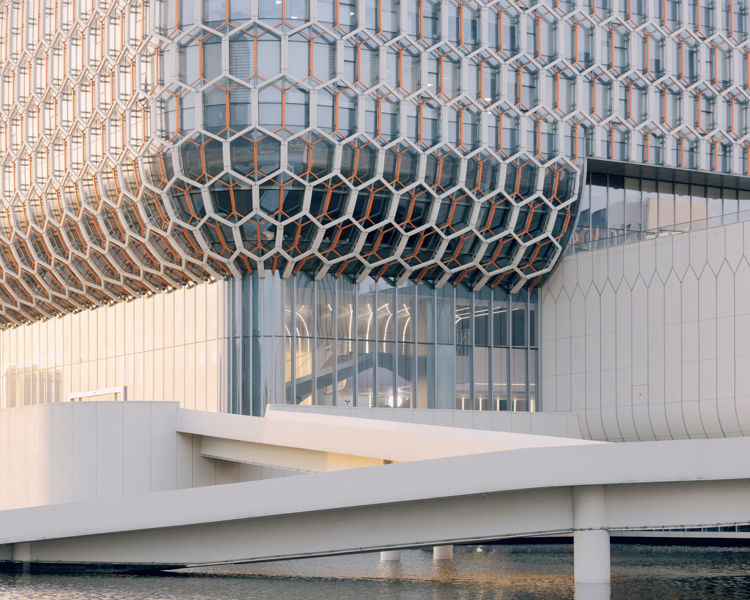
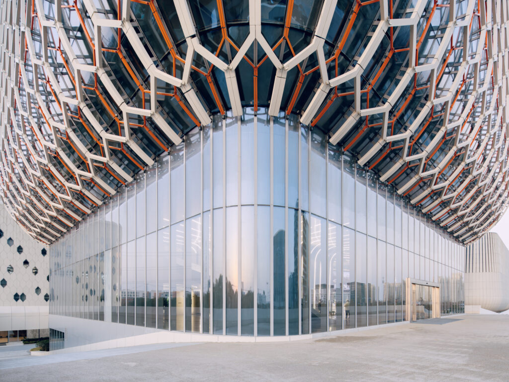
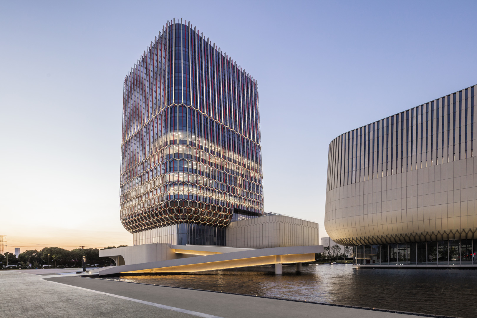
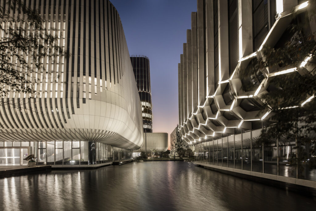
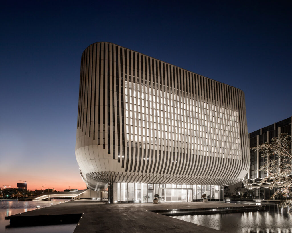
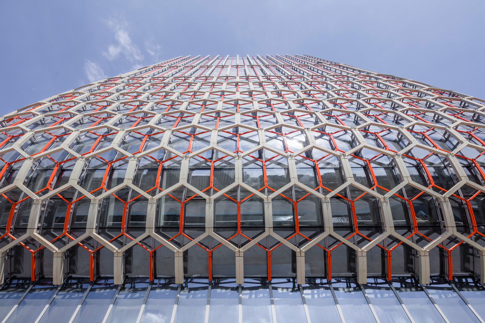
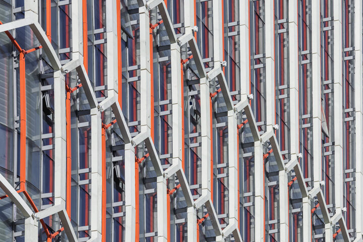
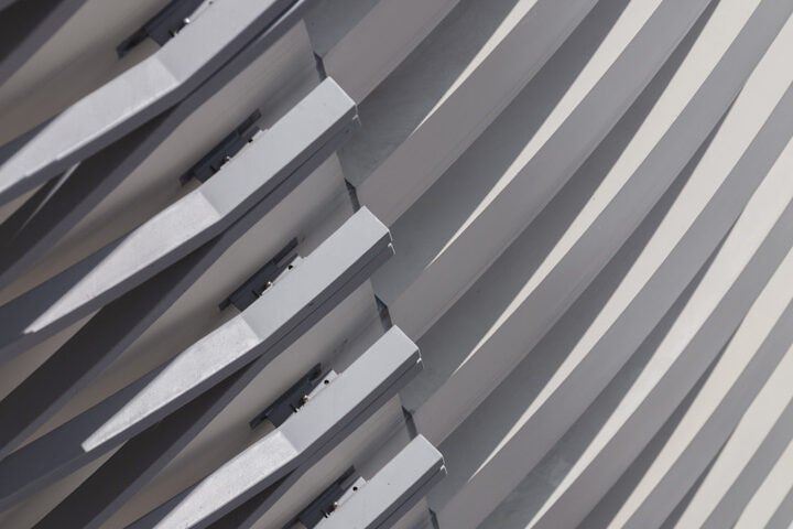
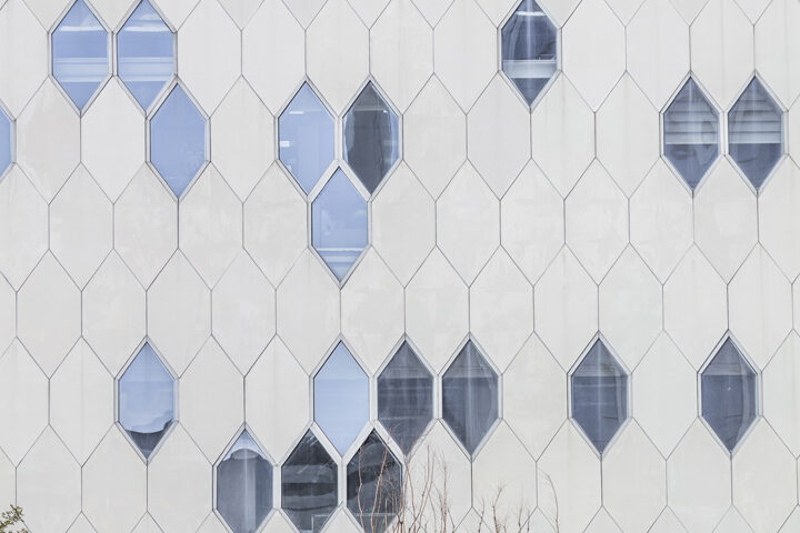
Ascentage Pharmaceutical Headquarters is a new research and manufacturing complex in Suzhou, China, for a growing pharmaceutical company. Reflecting the aspirations of Ascentage’s cutting-edge work in biotechnology, the state-of-the-art campus was realized using some of the most advanced digital design and fabrication tools available. The 80-meter-tall research and administration building—the new symbol of Ascentage—stands prominently on Xinqing Road near a mass-transit subway station.
Open, clean, and modern, the seven buildings take the form of discrete curvilinear shapes—soft in nature and elevated above glass bases, appearing to float above a reflecting pool clad in black granite.
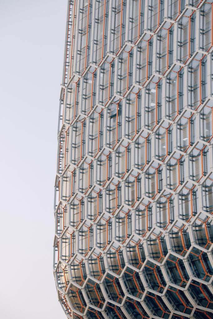
Each building’s façade is derived from the hexagonal form of a benzene ring, which is then parametrically modeled to wrap each volume. These facades are digitally fabricated using ultra-high-strength concrete panels, and anodized aluminum nodes and extrusions, resulting in a series of unique facades that strike a balance between transparency and privacy.
With high-tech research labs and expansive manufacturing spaces, the carefully programmed composition across the 60,870-square-meter site creates a singular campus and bold new identity for Ascentage’s promising future.
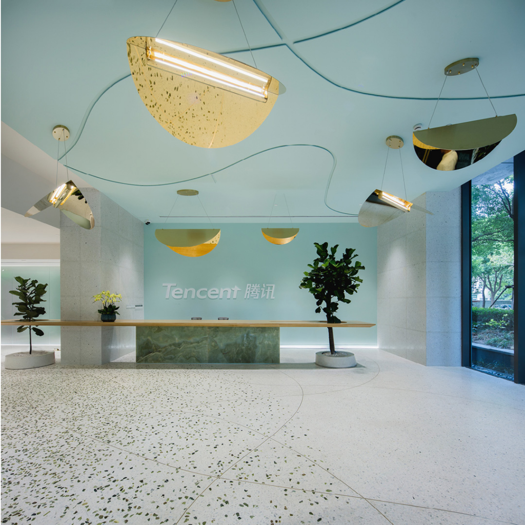
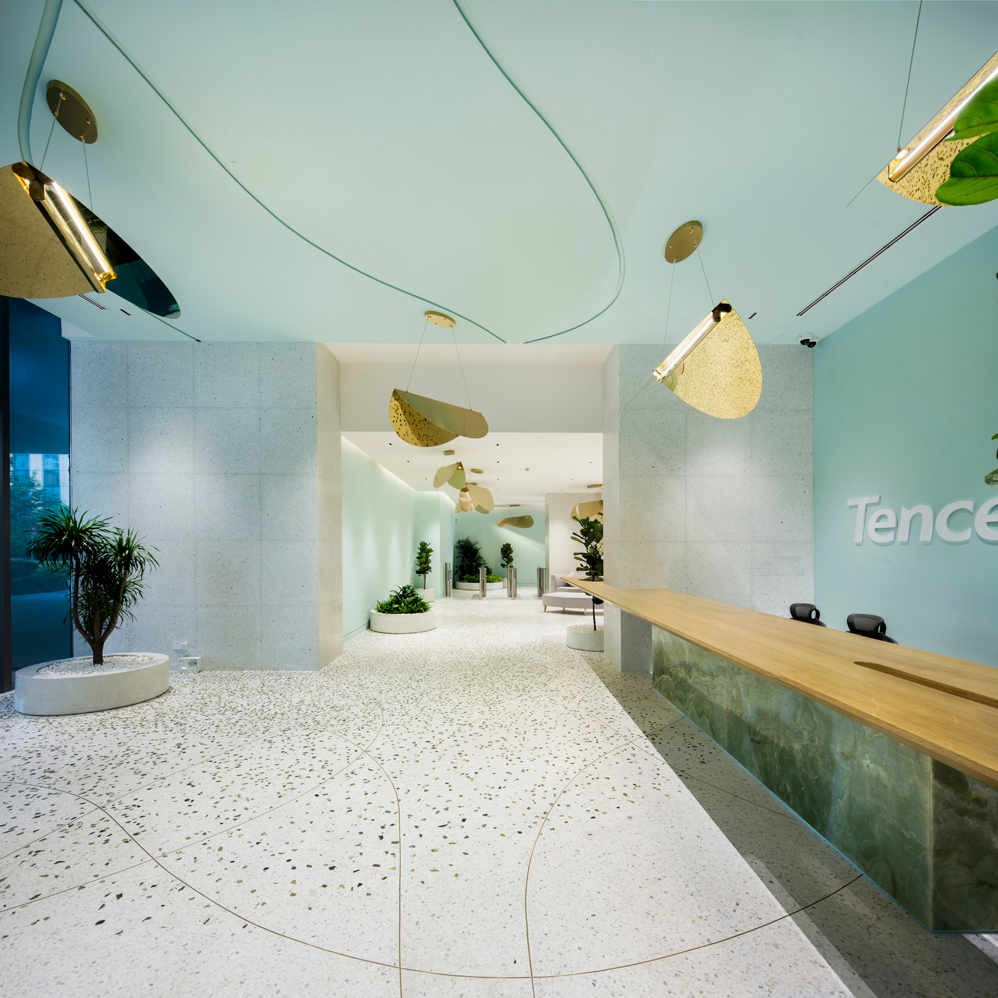
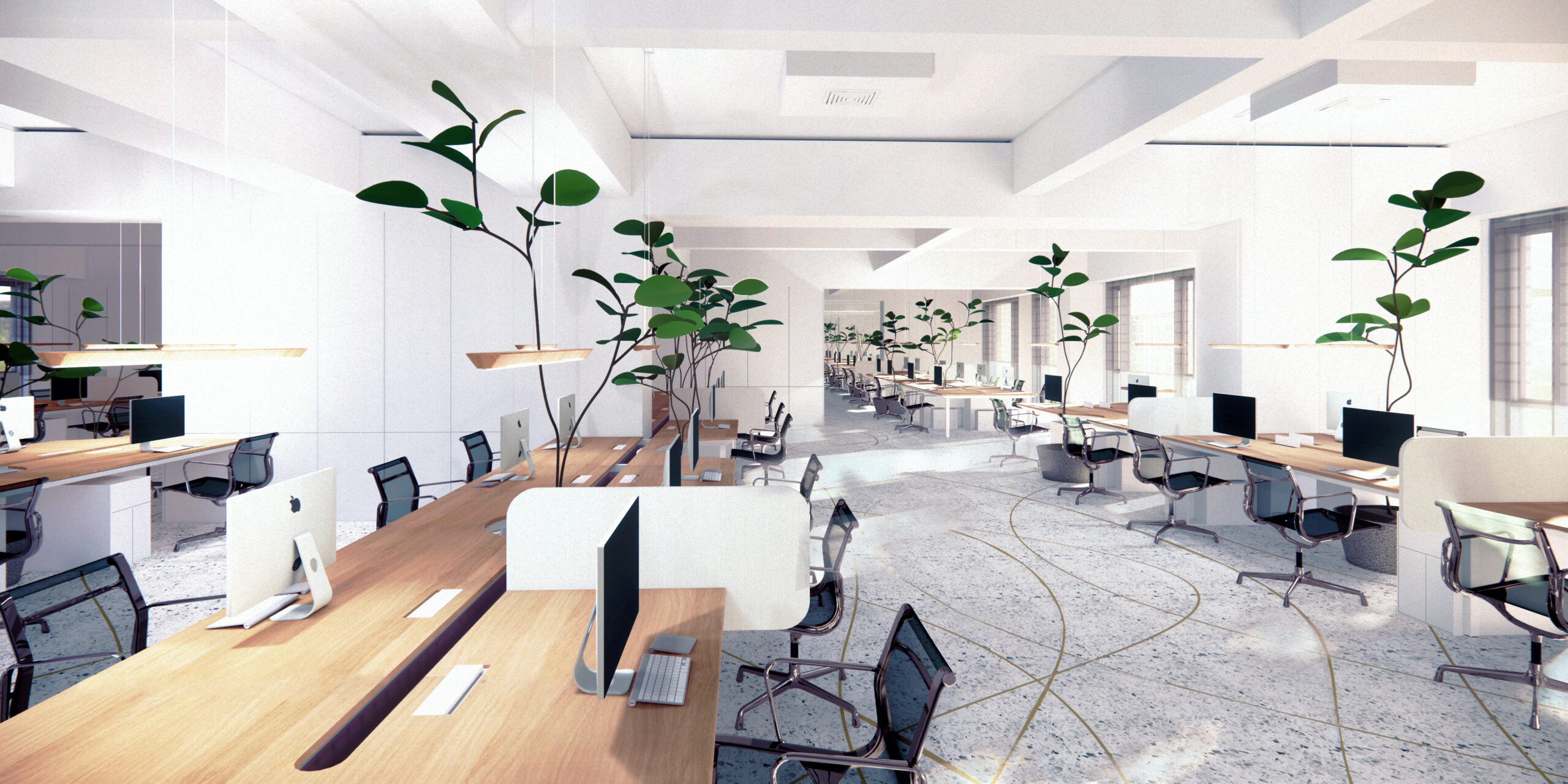
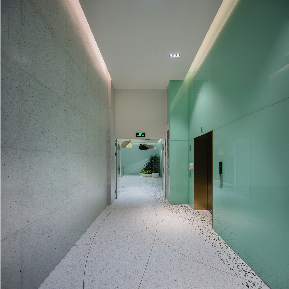
Multinational investment internet holding conglomerate Tencent has quickly become one of the world’s most valuable companies. With this newfound stature, the founders approached OLI to design an elevated, wellness-focused office for the company’s Cloud Computing division.
The resulting environment reflects both the company’s stature and relatively young engineering workforce. The design emphasizes a holistic approach to office well-being and balances collaborative open spaces with individual areas for heads-down work.
The design embraces simple principles and natural materials, marking a departure from the iconographic, multi-colored interiors of Tencent’s previous offices. Long, linear tables arranged on an open-floor plan replace the traditional room and cubicle partitions. Strategic table cutouts accommodate broadleaf plants and staggered floor-to-ceiling storage units incorporate varying levels of privacy and establish distinct zones throughout the office.
Symphony Orthodontics
Symphony Orthodontics
Design: 2021 Construction: 2022
• Winner of The SARA National Design Awards 2024 – Design Award Excellence • Winner of The SARA National Design Awards 2024 – Category Winner Architectural Interiors. • AIA Virginia 2024 Interior Design Honorable Mention. • AIA Pennsylvania (Tri-State) 2024 Merit Award in Interior Architecture/Healthcare Clinic Category. • Dezeen Awards 2023 – Longlisted in Health and Wellbeing Interior Category • 2023 Interiors Awards Finalists Announced- Healthcare
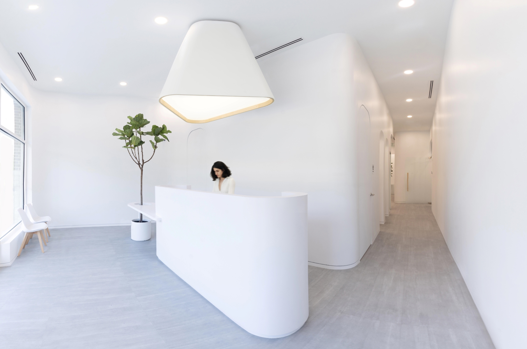
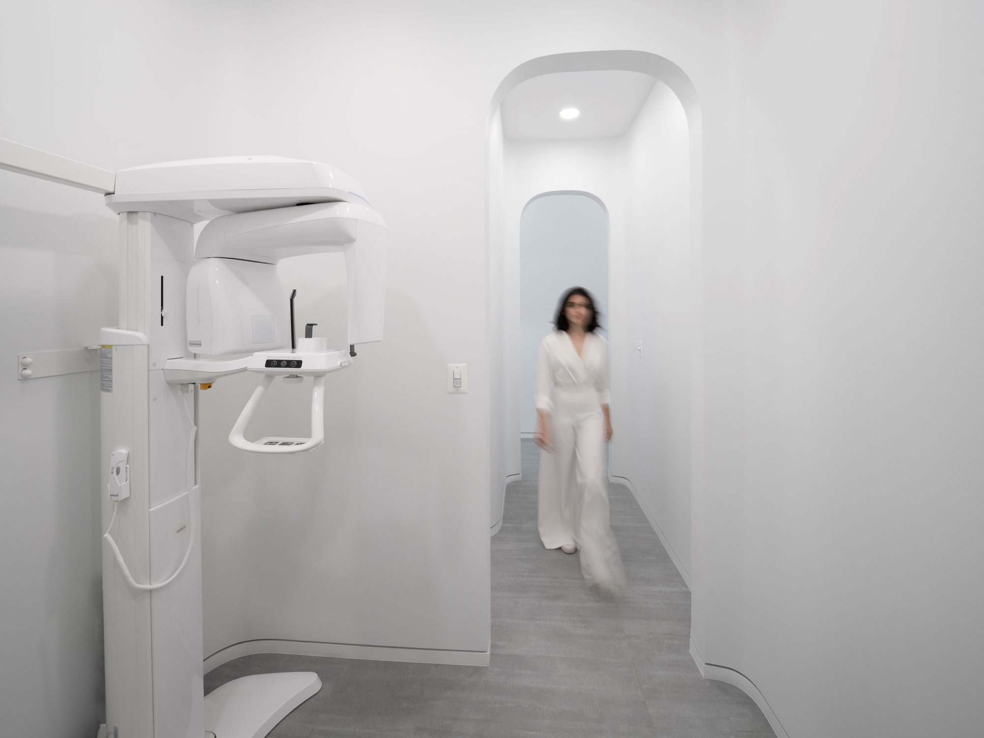
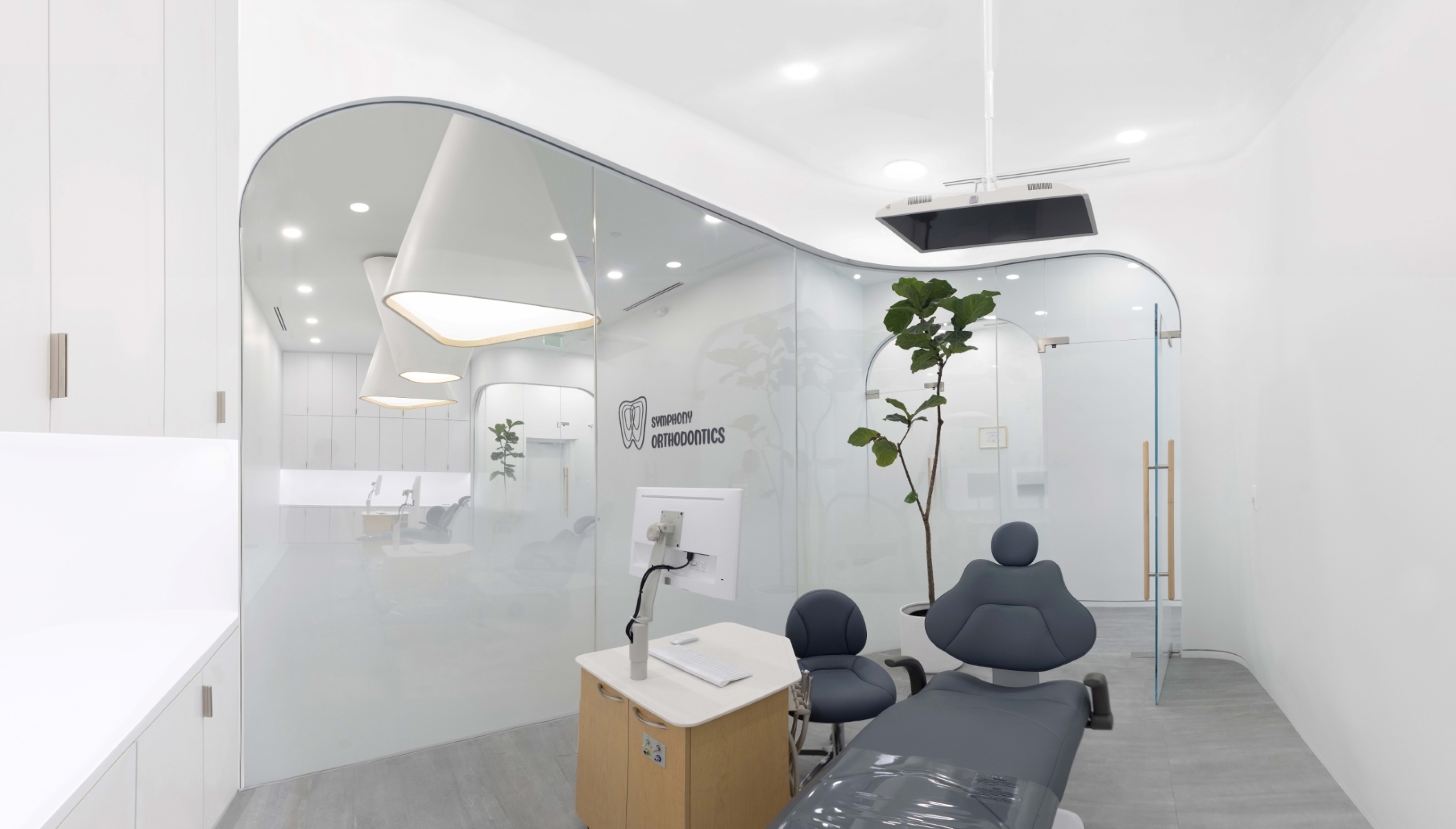
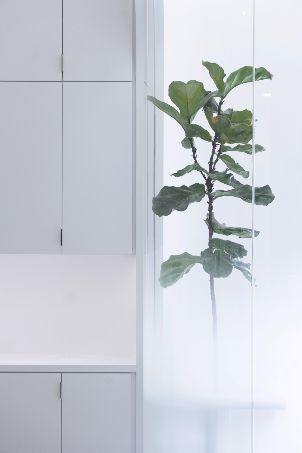
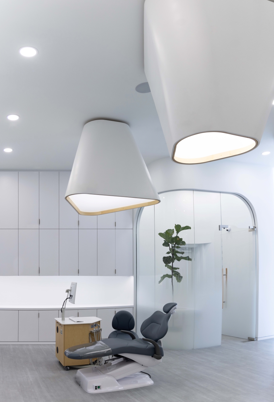
Symphony Orthodontics is a 1,500 ft2 clinic founded by an Orthodontic specialist, in an area of Virginia with a latent demand for treatment. The client sought a welcoming and inclusive strategy for her first outpost, to gain the trust of new patients. The design of the new clinic also needed to feel innovative to reflect the state-of-the-art treatments on offer and generate a buzz in the community.
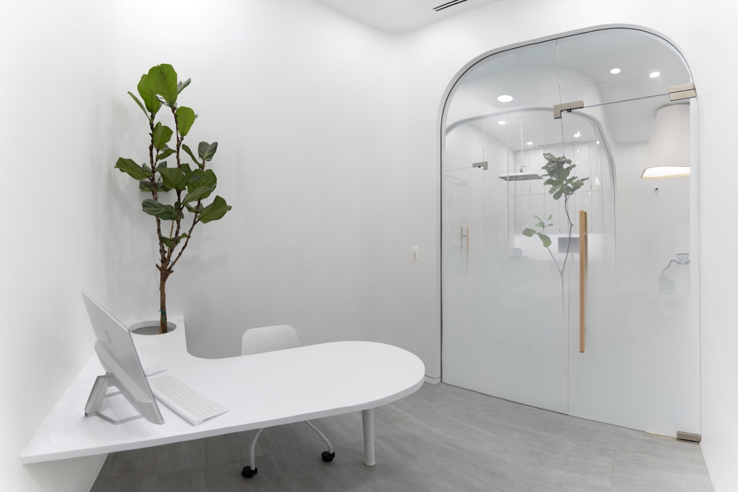
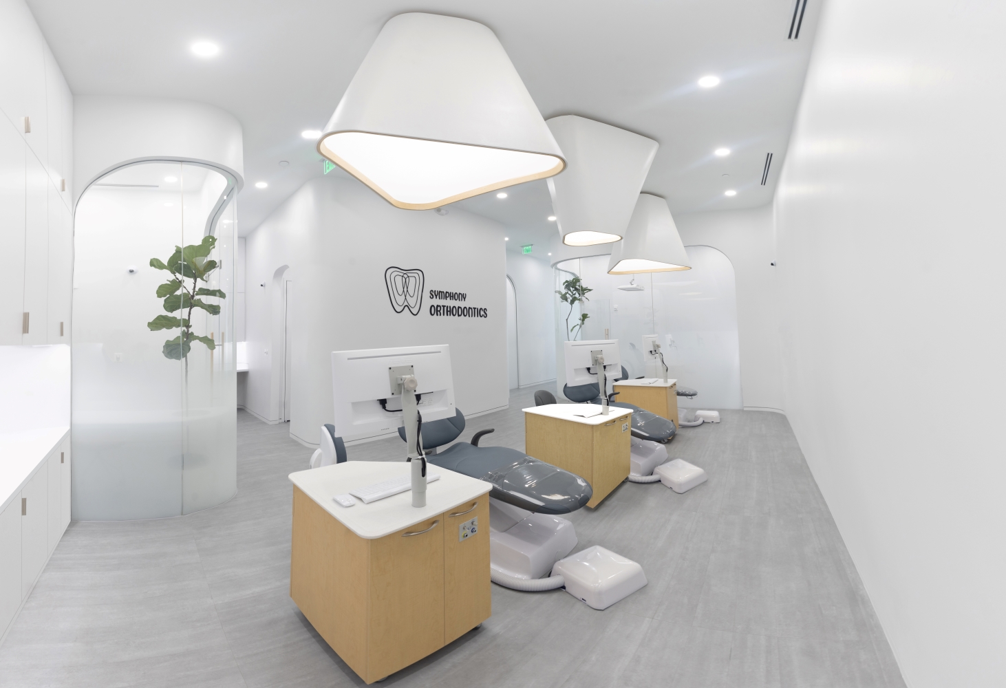
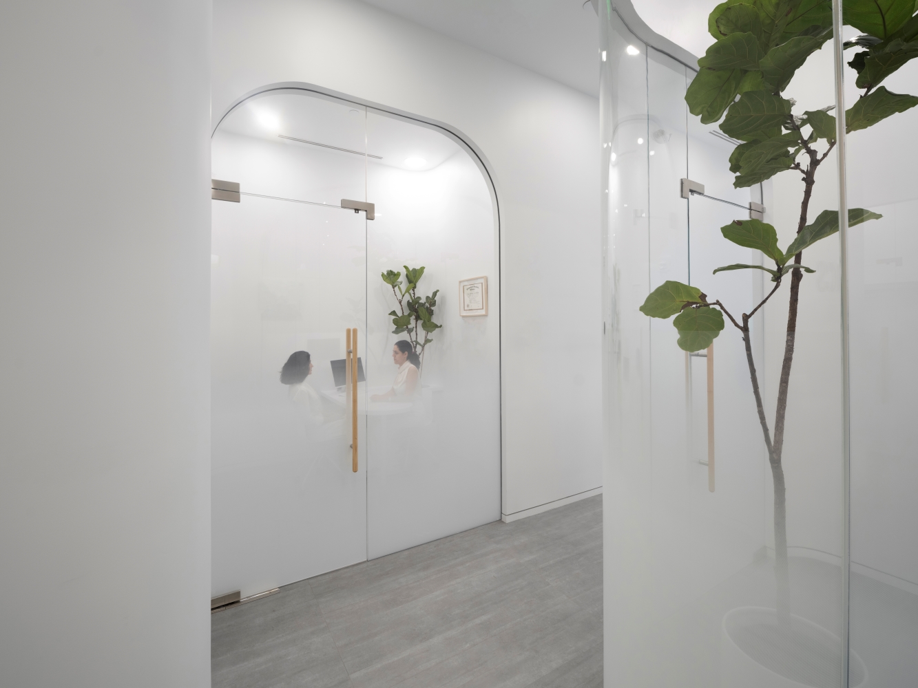
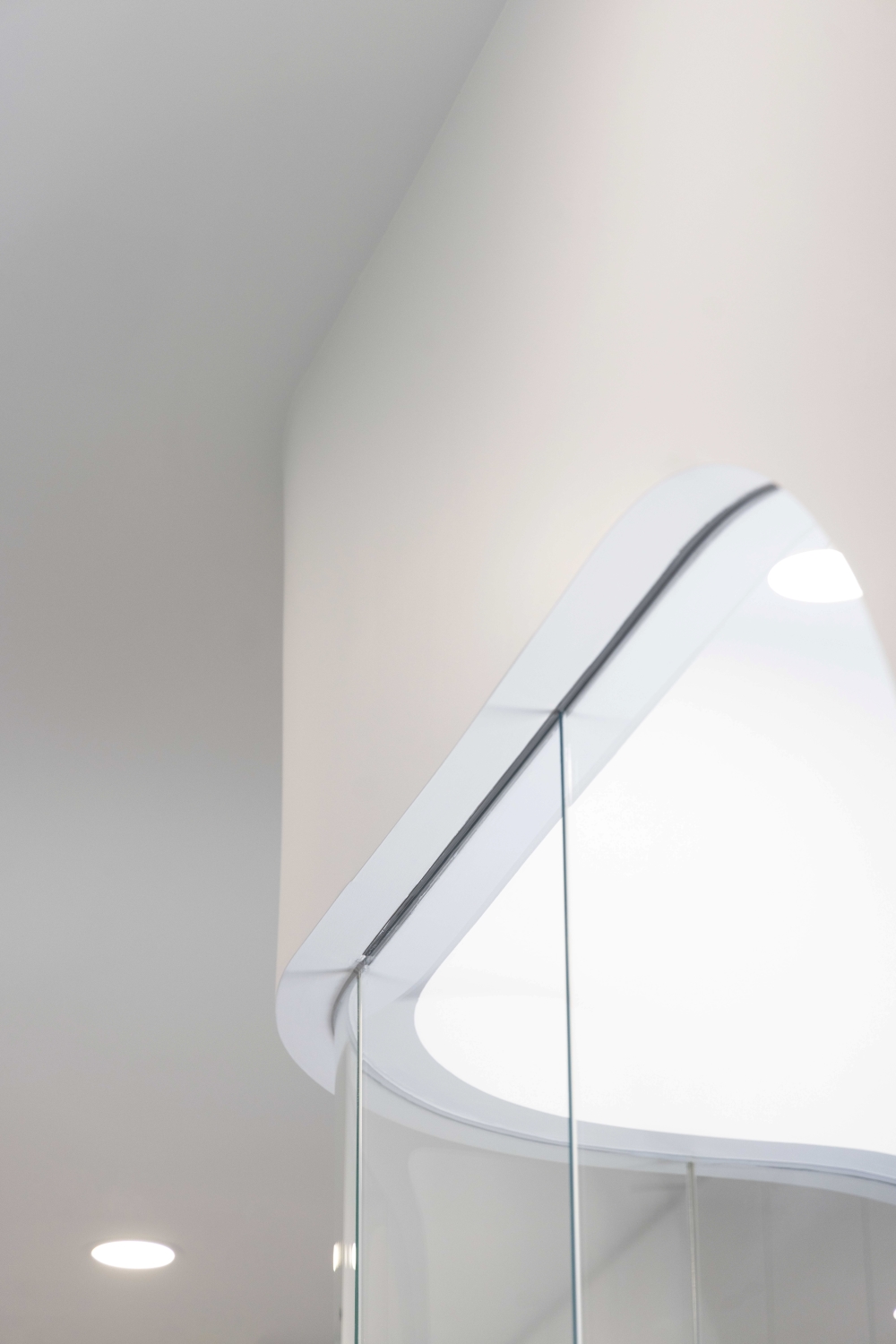
To meet this challenge, OLI Architecture designed a series of flowing open and enclosed spaces with sinuous organic lines. The integration of white surfaces (which enhance levels of natural light) and live trees throughout the space are strategies deployed in Evidence-Based Design (EBD) to promote healing and reduce stress. Ultimately, the desire was to elevate the space beyond a medical environment, with attention also given to custom millwork surfaces, from a curved reception desk and volumetric sculpted lights to frameless curved wood doors. Quality craftsmanship and custom-made details take priority over ready-made commercial products to highlight the clinic’s custom-made treatment approach.
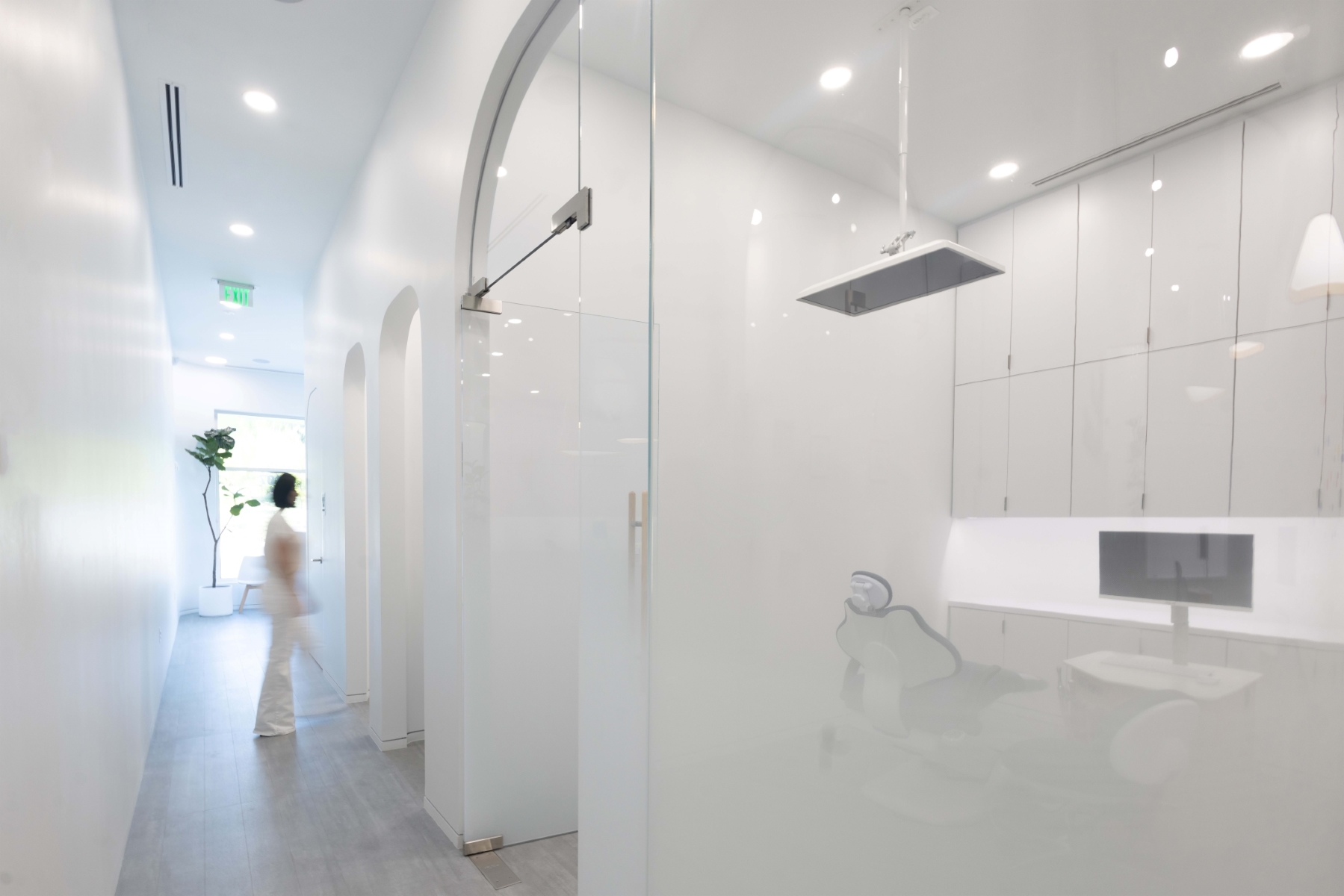
Incorporating a complex and varied program within a narrow, linear footprint posed a unique design challenge. While fluidity, connectivity and efficiency are key in times of high foot traffic, it was important to maintain strict programmatic delineations, such as between the public waiting room, treatment areas and delivery access. The fine balance between public and private is also achieved by incorporating elements such as gradient frosted glass, which maintains privacy and keeps patients at ease, while creating visual and cognitive transparency between staff and patients.
An emphasis on sustainability was threaded throughout the project. All materials, even the low-iron, ultra-clear curved-glass partitions, were locally sourced. Every light received an LED bulb and motion-sensor, including the striking ornamental fixtures. Motorized outdoor air dampers and exterior door seals decrease HVAC loads, while insulated partitions and ceiling cavities boost R values. Monolithic white volumes and surfaces, together with high ceilings, maximize light and air flow throughout the space; live plants improve air quality. LVT flooring, selected for durability, meets WELL and LEED certification standards and is free of phthalates (particularly detrimental to children).
The resulting design offers a new take on the clinical: a clean and neutral space in which harsh corners are softened and stress and tension is substituted with serenity, embodying the clinics holistic approach and restoring smiles to young patients.
BSM Service Center
Design: 2020-2024 Construction: 2022-2025
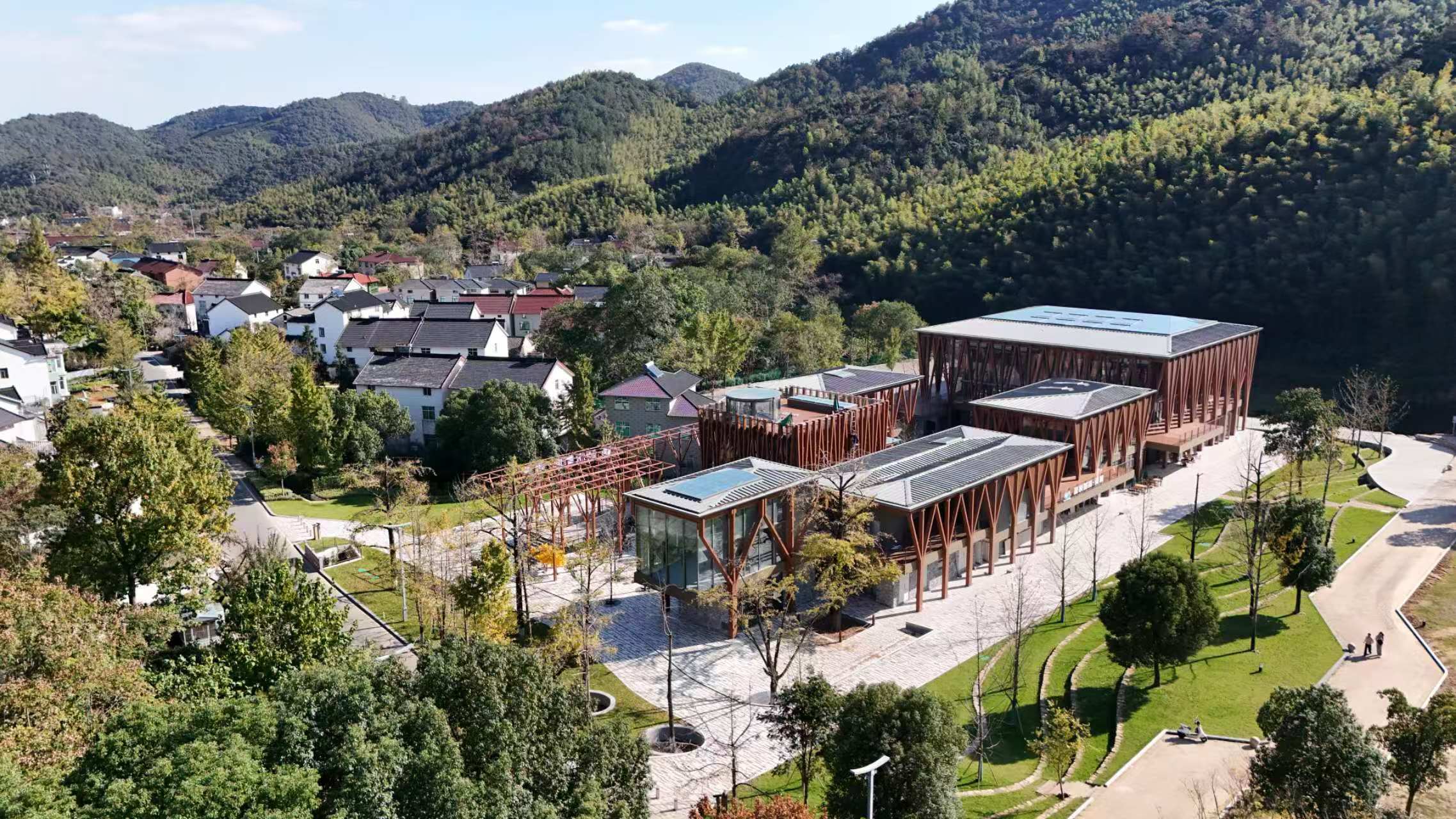
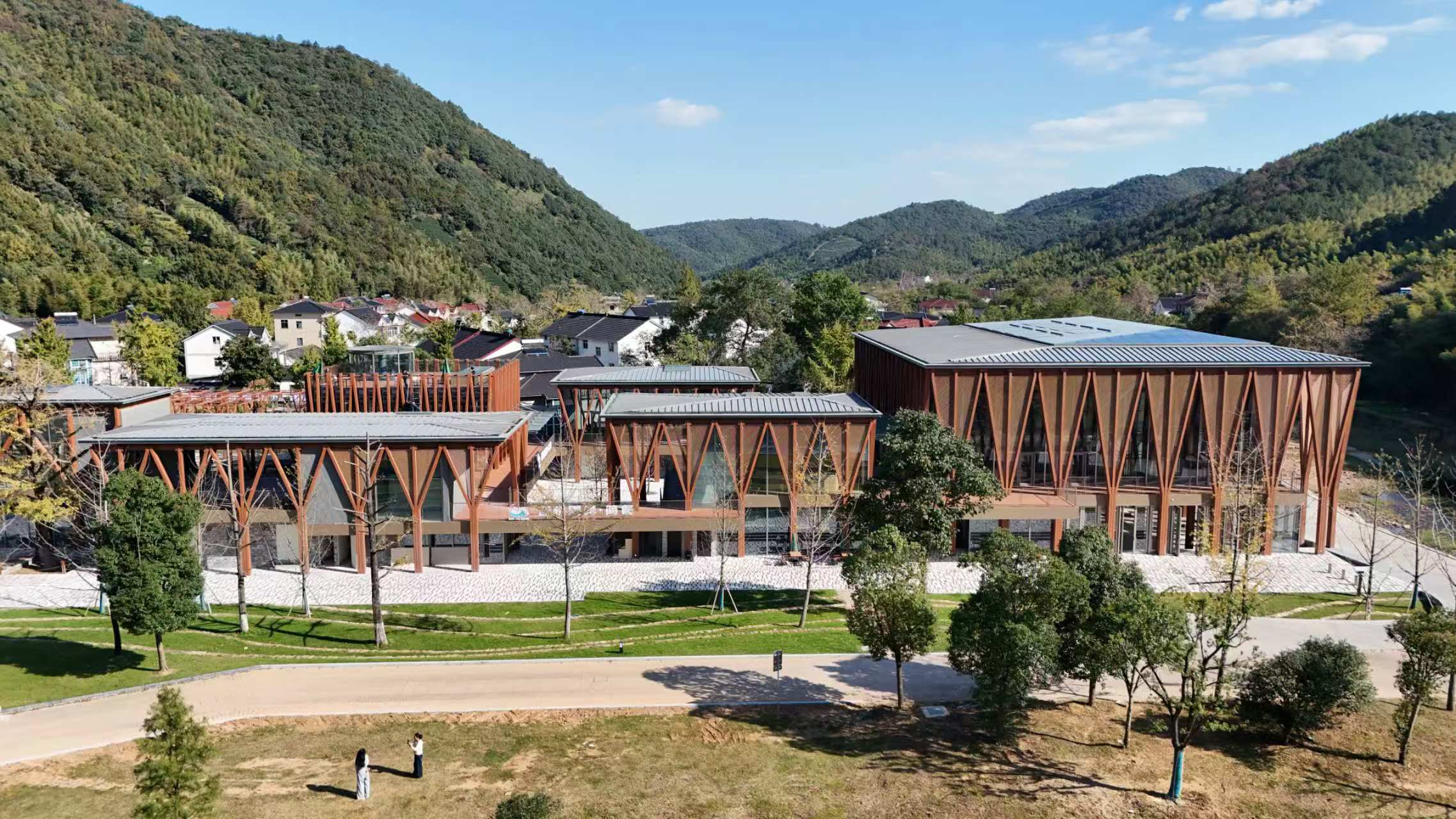
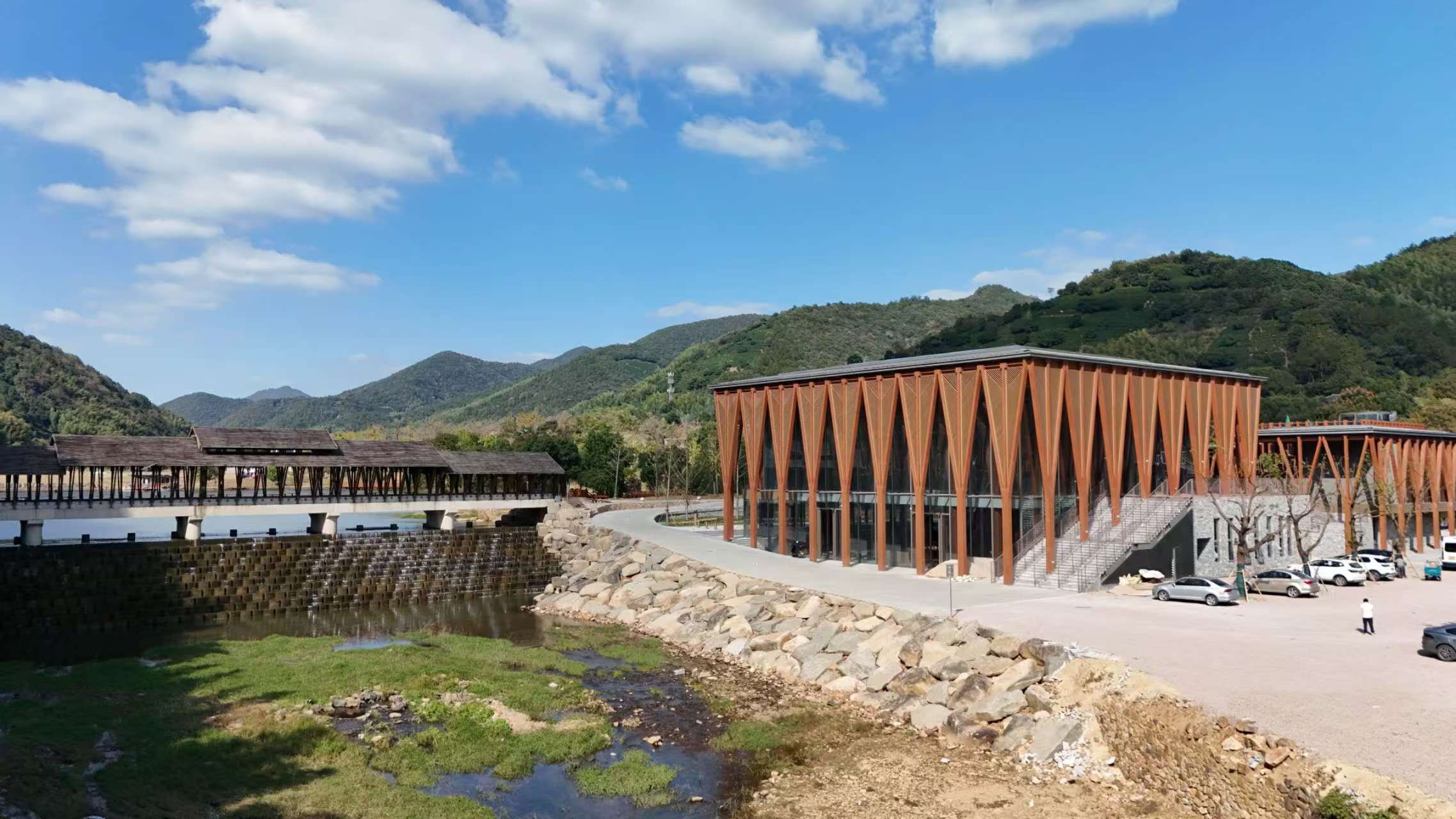
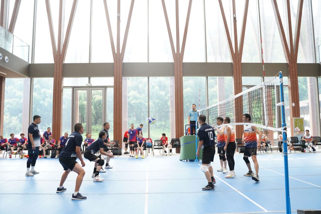
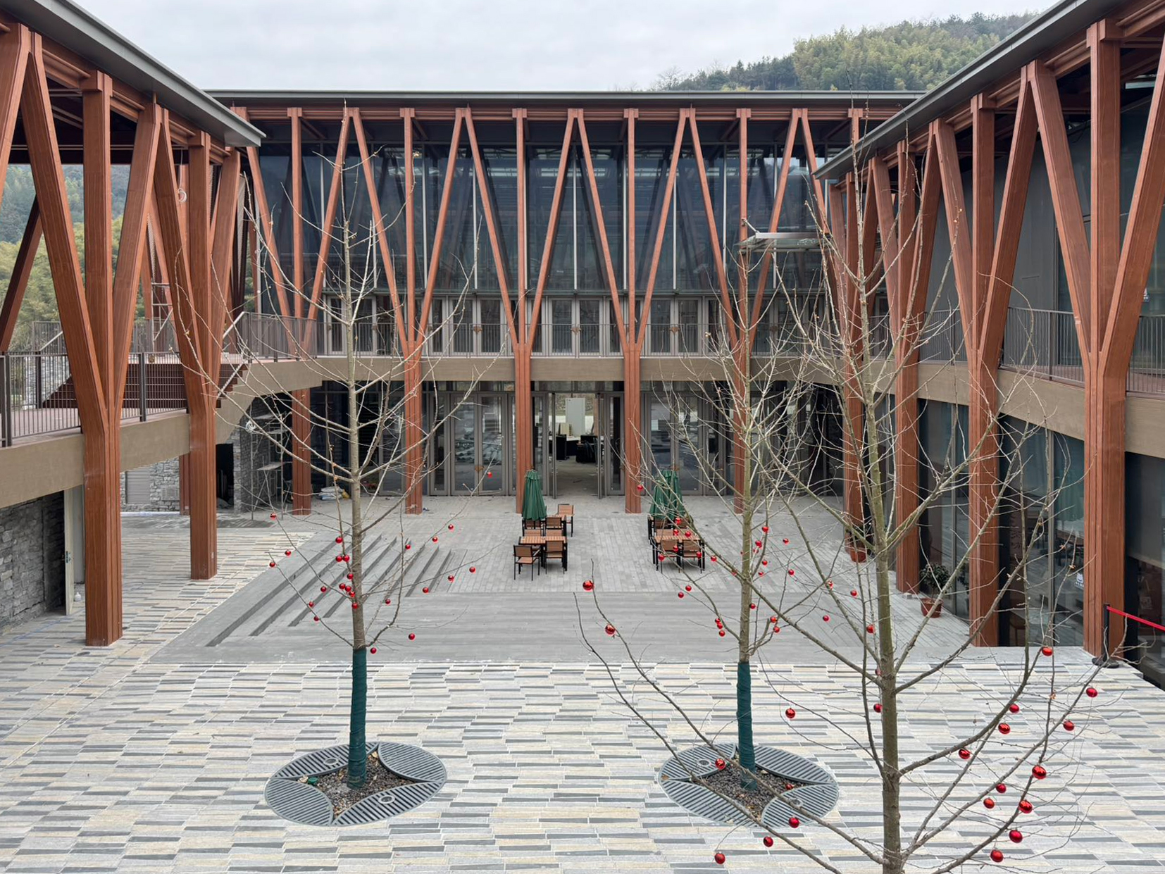
Changxing County Xiaopu Town Smart Village Management Service Center is located in the scenic area of Baduqian, Xiaopu Town, Changxing County. It will serve four natural villages, namely, Dajiakou, Panlinan, Fangyan and Fangyi. The building of the service center is located on the shore of Badu Weir. Like a floating village among ginkgo trees, it will provide services to the villagers, and will also become a new landmark and attraction in the Badu Qin scenic area.
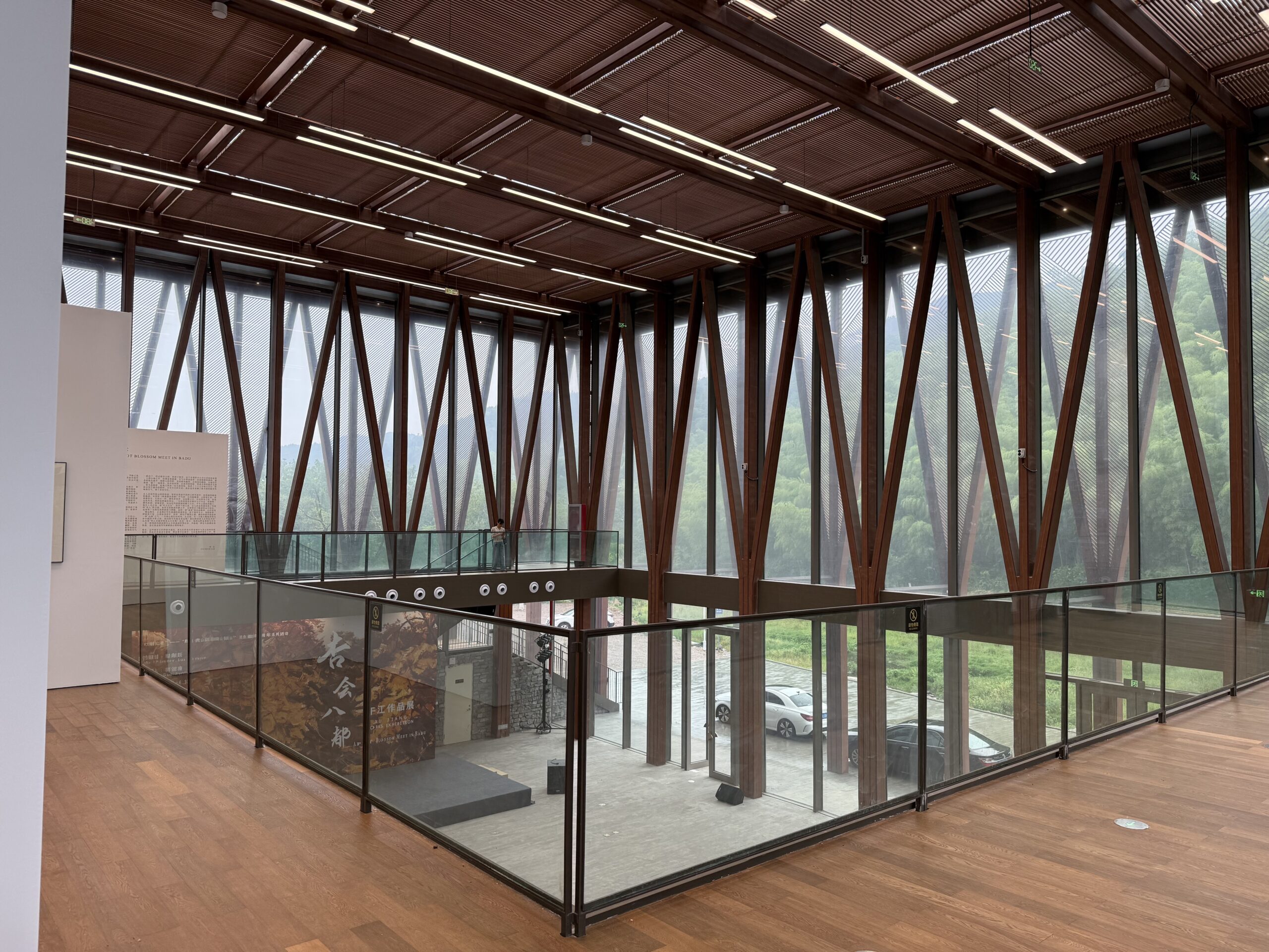
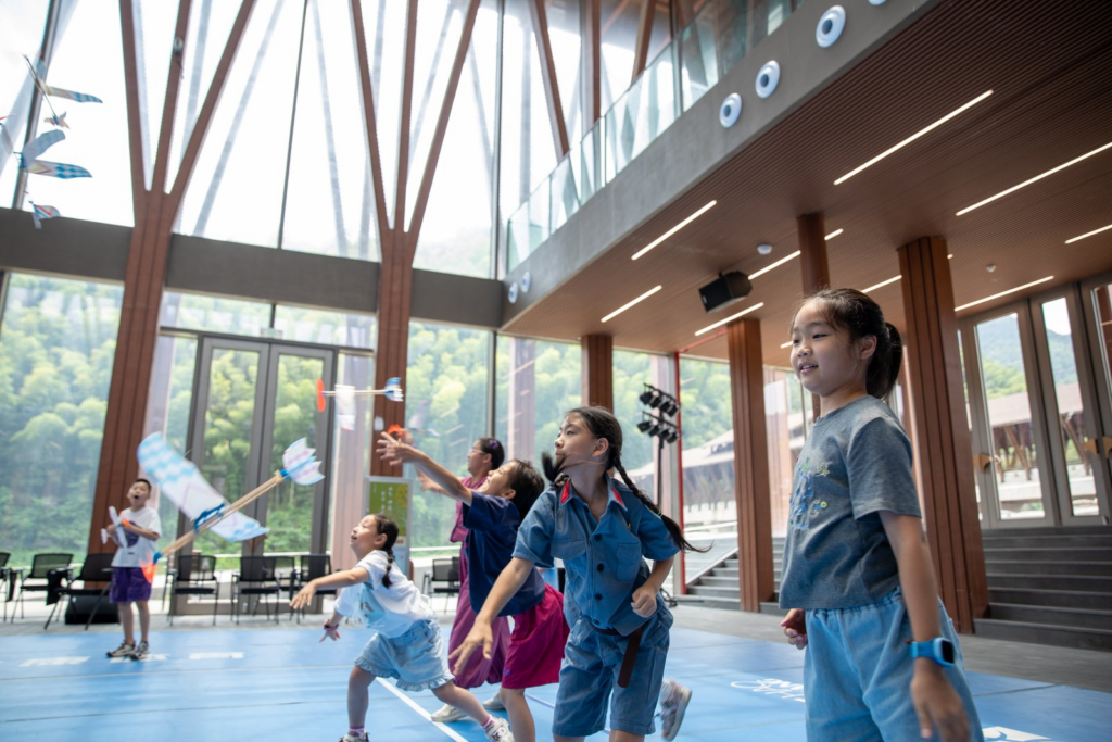
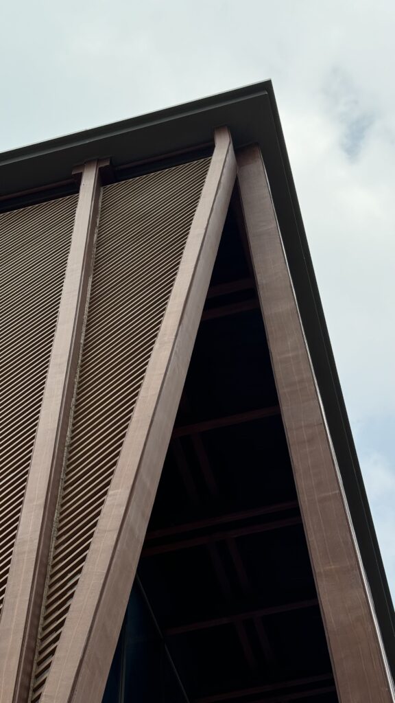
The architectural design concept of the service center originates from the beautiful and spectacular ancient ginkgoes in the Baduyan Scenic Area. The central building consists of tall wooden pillars shaped like the trunk of a ginkgo tree, connected by a platform and a roof. The center consists of a cluster of buildings with different functions, connected by a network of columns and lifted up to ensure an unobstructed view of the surrounding water and trees. The buildings with different functions are connected by yellow platforms, among which there are small ginkgo gardens, sun corridors and communication spaces. The roof, supported by wooden columns, is made of polycarbonate, and the ceiling is made of colored wooden strips, where the sunlight is dispersed and shines softly on the ground, as if it were a crystal clear ginkgo tree in autumn.
The largest space is the multi-functional hall, which can hold large wedding banquets of 450 people. The perimeter of the banquet hall is slightly stepped, and the space can be divided or combined to hold events of different scales.
The design will use old wood as much as possible to increase the sustainability of the project and to echo the surrounding ginkgo trees and the old timber frame house. Some structures can be prefabricated and assembled on-site to speed up construction. Wooden structures will also bring a comfortable sense of nature and warmth to people, moving their heart and reducing their stress.
The Smart Village Management Service Center in Xiaopu Town will be an environmentally friendly, comfortable, natural and people-oriented center for villagers and will receive guests from all over the world around the clock, becoming an important landmark attraction in the Badujiao scenic area.
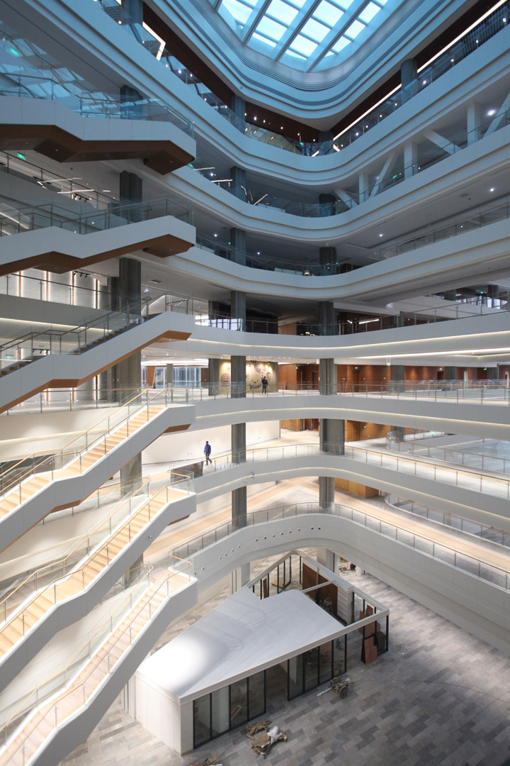
Tencent BJ
Design: 2017-2019 Construction: 2018-2019
Designed by the Office of Metropolitan Architecture, the new Beijing Headquarters for Tencent, multinational internet conglomerate, and the 13th most valuable company in the world (by Forbes), required unified design for the signage and wayfinding systems, as well as placemaking environmental graphics in key strategic public areas. In collaboration with Pentagram, the world’s largest independently-owned, multidisciplinary design firm, OLI was tasked to unify the sprawling multilevel headquarters with strategic signage and wayfinding interventions. The design team through careful analysis of the building layout and occupant flow, designed minimal digital placemaking interventions in key public nodes, providing distinct landmarks within the strong architectural character of the new complex, and a common visual and material language for the thousands of employees the new HQ would accommodate.
Additional changes to the interior architecture through discrete interventions have been strategically developed with an emphasis on maximum impact while considering and honoring the original design intent of the space and the schedule of construction minimizing abortive works.